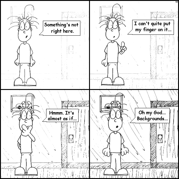
I'm not really sure why I decided to add backgrounds to the hand-drawn comics. I think, at the time, I wished I could include more complicated backgrounds in the sprite comics, but I didn't have the skill to do so. I suppose I decided that I would change that with the hand-drawn comic. The problem was, without Photoshop I couldn't work with layers, and that can make working with backgrounds quite difficult.
That is, with a program like Photoshop, Paint Shop Pro, or GIMP, you have a background layer, with the characters and objects placed on separate layers above that. If you don't like where something is placed, you simply move it. Once you're happy with everything, you can then flatten the image into something viewable on the web. Without a more complicated graphics program, though, once you've pasted a character onto a background, it's there for good. If you later decide you don't like where George is placed, you have to clear the panel and start over. And that is why I usually didn't use backgrounds, especially complicated backgrounds, especially near the beginning of the comic. I learned that lesson the hard way, with the FARTS crossover storyline.
You might notice that dithering problem, that I've mentioned in previous commentaries to explain the lack of color, around George's head, especially in the last panel. I knew it would be a problem if I introduced backgrounds, but I ultimately decided that as long as I stayed in grayscale, it shouldn't be too bad.
Also, yes, those are truly some hideous backgrounds. But I like the way George looks in this comic, especially the third panel. I must've drawn that damn pose a dozen times before doing it just the way I wanted.
|
